Cart
0
Free delivery to Sweden in 2–5 business days
Fast and reliable shipping with tracking included.


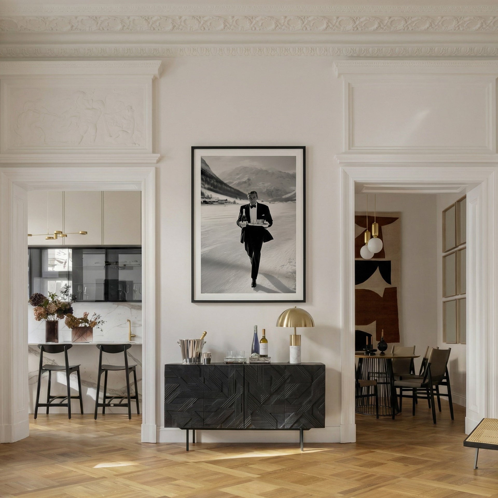
The most common mistake in a quiet luxury interior is not choosing the wrong sofa, the wrong rug, or the wrong paint colour. It is choosing art that contradicts everything else in the room.
A space can have the right proportions, the right materials, the right restraint in every other decision — and then hang a print that reads as decorative rather than considered, and the effect collapses. The room starts to look assembled rather than arrived at.
This is the one thing most rooms get wrong. Not the furniture. The art.
Understanding why requires a clearer sense of what quiet luxury actually is — and what it is not.

Quiet luxury is not a neutral palette. Plenty of rooms with warm beige walls and linen sofas are not quiet luxury — they are simply undecided. The aesthetic requires active choices, not the absence of choices.
It is not a price point either. Expensive objects can announce themselves loudly. The entire logic of quiet luxury runs in the opposite direction: value is communicated through the quality of materials, the confidence of composition, the sense that nothing in the room is there by accident. Visible price tags — in the form of recognisable logos, obvious brand signals, or pieces selected specifically because they cost a lot — are the opposite of the aesthetic, regardless of what they actually cost.
And it is not minimalism. Minimalism is a formal discipline with specific rules about reduction and negative space. Quiet luxury interiors can be quite full — they simply feel curated rather than accumulated. The difference is whether each object has earned its place.
What quiet luxury actually is: an aesthetic of earned confidence. Every element in the room reflects a genuine decision, made by someone who knows what they like and does not need external validation for it. The room is not performing for anyone. It is simply itself.
Furniture is relatively easy to get right in a quiet luxury interior. The category has a clear grammar — quality materials, clean lines, nothing that shouts. A linen sofa in a good cut, a solid wood table without ornament, a rug with texture rather than pattern. These decisions have a legible logic and there is plenty of guidance available for navigating them.
Wall art is harder because the category is less structured. There is no equivalent grammar. And because art is the most visible thing in a room — the element the eye moves toward first, the thing guests comment on — a wrong choice is more disruptive than a wrong choice in almost any other category.
The specific failure mode in quiet luxury interiors is choosing art that is decorative rather than purposeful. Decorative art says: I wanted something on this wall, and this filled the space. Purposeful art says: I chose this, and the room is different because of it.
Decorative art in a quiet luxury context tends to share certain characteristics. It is usually genre art — botanical prints, abstract washes, landscapes that could be anywhere — chosen because it is inoffensive and broadly appropriate to the palette. It does not ask anything of the viewer. It does not have a point of view. And in a room that is otherwise built around considered, confident decisions, that absence of conviction reads immediately.

The art that works in a quiet luxury interior tends to have several qualities in common, none of which are about style or subject matter specifically.
It has specificity. A generic landscape is decorative. A landscape that captures a particular quality of light at a particular hour in a particular place is purposeful. The specificity communicates that the image was chosen for a reason, not selected from a shortlist of inoffensive options.
It has a point of view. The image should have a clear compositional intention — a reason for being cropped the way it is, for being shot at that moment rather than another. Photography that looks like it was made by someone with a specific vision communicates a different quality than photography that looks competent but generic.
It rewards sustained attention. Decorative art depletes quickly — you take it in once and the eye moves on. Purposeful art continues to offer something on repeated viewing. A figure whose expression implies a story. A detail in the background that only reveals itself at a certain distance. A tension between elements that the image does not resolve. This quality of depth is what makes art feel worth having rather than worth having filled the space.
It holds the room without competing with it. This is the technical challenge. The image needs presence — enough visual weight to anchor the wall — without demanding the room organise itself around it. In practice this usually means choosing a single strong piece rather than multiple smaller pieces, and choosing a scale that is confident rather than cautious.
Quiet luxury wall art does not have a prescribed subject matter, but certain categories work more consistently than others because they carry the right associations without being obvious about it.
Mid-century leisure imagery — poolside, alpine, coastal — tends to work well because it operates within the visual language that quiet luxury draws from. The aesthetic of unhurried confidence, of privilege worn lightly, is built into the subject matter rather than imposed on it. A well-chosen alpine print, for instance, does not need to announce anything about the life it depicts — the quality communicates itself. The Belora alpine collection approaches this directly: prints from an era when the mountains were a destination for those who understood that the best things require some elevation.
Black and white photography works particularly well in quiet luxury contexts because it removes the question of colour entirely. A strong monochrome image integrates with almost any palette and reads as more considered than its colour equivalent, simply because the decision to remove colour implies a deliberate aesthetic choice. It signals that the image was selected for its composition and subject rather than for its ability to match the cushions.
What tends not to work: abstract art chosen for palette matching, motivational or typographic prints of any kind, prints that are clearly trend-responsive rather than timeless in their subject matter, and anything that looks like it was selected from the same source as the furniture.
Quiet luxury interiors with a single undersized print on a large wall are among the most common failures in the category. The restraint that the aesthetic values is interpreted as an argument for small, cautious choices — and the result is a wall that looks unfinished rather than refined.
Restraint in quiet luxury means fewer elements, not smaller ones. A single 70×100 cm print, placed well on a large wall, reads as a confident choice. Three smaller prints arranged in a group reads as decorative wallmaking. The former is quiet luxury. The latter is interior decoration.
The framing decision matters too. Heavy, ornate frames signal a different aesthetic entirely. For quiet luxury, solid wood in a simple profile — natural or dark finish, no ornament — lets the image do the work. The frame should be present enough to finish the piece and absent enough not to become a second object in the room.

The practical conclusion from all of this is simpler than it sounds: choose one piece of art for each wall that needs one, choose it with genuine conviction rather than decorative logic, and scale it appropriately.
That single decision — made once, made well — does more for a quiet luxury interior than almost any other choice in the room. It is the thing guests remember. It is the thing that makes the space feel particular rather than assembled. And it is, reliably, the last thing most people address when putting a room together, which is why so many otherwise well-considered interiors still feel slightly incomplete.
The Belora old money wall art collection is built around exactly this logic: prints with specificity, point of view, and the kind of unhurried confidence that holds a room without announcing itself. Each piece is printed on museum-quality matte paper with fade-resistant inks, produced to order and shipped worldwide.
For a closer look at the specific visual principles behind the aesthetic — composition, scale, subject matter, and the one framing mistake that gives it away — the guide to old money wall art covers the detail. For the role art plays in quiet luxury interiors more broadly, the earlier piece on why art matters more than furniture sets the context.
Quiet luxury is not a look. It is a standard of decision-making. The art in the room is where that standard is most visible — and most often compromised.


