Cart
0
Free delivery to Sweden in 2–5 business days
Fast and reliable shipping with tracking included.


Most gallery walls look like a project. Frames of different sizes, different colours, different styles — collected over time, arranged on a Sunday afternoon, and hung with more optimism than conviction. The result is something between a mood board and a collection of things that did not have anywhere else to go.
There is nothing wrong with that, as such. It is a legitimate approach to filling a wall. But it is not what this guide is about.
This is about the gallery wall as a deliberate choice — one that works in the kind of home that has been put together with care and attention to everything else. The kind of home where the sofa was chosen, not settled for. Where the palette was decided, not inherited. Where the person living there has a point of view and the room reflects it.
In that context, a gallery wall requires a different approach than the one most guides describe.

The canonical gallery wall guide — mix sizes, vary frames, combine art with objects, lay it out on the floor first — is good advice for a specific kind of outcome. It produces something eclectic, personal, slightly chaotic in a charming way. It reads as the accumulated visual life of someone who has been collecting things for years.
That is not what works in a considered home. In a room that is otherwise restrained — where every other decision reflects a clear aesthetic standard — the eclectic gallery wall reads as an interruption rather than an addition. The deliberateness of the rest of the room makes the casualness of a mixed arrangement look accidental rather than personal.
The grown-up gallery wall is not eclectic. It is edited.
Editing in this context means choosing prints that belong together without being identical. They should share a visual language — a palette, a register, a period, a mood — without being a matched set. The difference between a curated arrangement and a matched set is that a matched set looks purchased. A curated arrangement looks chosen.
In practice this means deciding on a single consistent frame and letting the images carry the variation. Or deciding on a consistent subject territory — mid-century leisure, alpine, coastal — and letting the compositions vary. Or committing to a single palette, whether colour or monochrome, and selecting images within it.
What it does not mean: mixing black frames with natural wood frames. Combining photographs with typographic prints. Hanging art alongside clocks, mirrors, or decorative objects. These are all legitimate approaches to wall arrangement, but they are not the approach that produces the result this guide is working toward.
The governing question for every decision in a grown-up gallery wall is: does this look like it was chosen, or does it look like it was collected? Chosen is the goal. Collected is the failure mode.
The single most reliable way to elevate a multi-print arrangement is to standardise the frame. One frame profile, one finish, consistent across every piece in the arrangement. This is the decision that turns a group of prints into a considered display rather than a collection of individually framed things that happen to share a wall.
For a quiet luxury or old money aesthetic, the frame should be simple: solid wood, clean profile, natural or dark finish. No ornament, no metal, nothing that becomes a second visual element competing with the image inside it. The frame is there to finish the piece, not to be noticed.
Size variation within a consistent frame works well. A larger anchor piece flanked by two or three smaller pieces, all in the same frame, reads as deliberate arrangement. The same combination in three different frames reads as assembly.
Gallery walls in considered homes tend to be smaller than the internet suggests they should be. The standard advice is to fill the wall — to push the arrangement to the edges of the available space, to add more pieces rather than fewer. In a grown-up context, the opposite tends to produce better results.
A tight arrangement of three or four pieces, centred on a large wall, reads as a deliberate compositional choice. It gives the wall breathing room and communicates confidence: this is intentional, not inadequate. The wall around the arrangement is not empty — it is part of the arrangement.
Spacing between pieces should be consistent and tight rather than generous. Approximately 5 to 8 centimetres between frames is enough to read as separate pieces without creating the sense that the arrangement is unfinished or sparse. Wider gaps make a small number of pieces look like they are waiting for more company.
The strongest multi-print arrangements share a subject territory that is specific enough to create visual coherence without being so narrow that the pieces look identical. Mid-century leisure is a good territory: it encompasses alpine, coastal, poolside, travel — enough variation in composition and setting to keep things interesting, unified by a consistent aesthetic register and period.
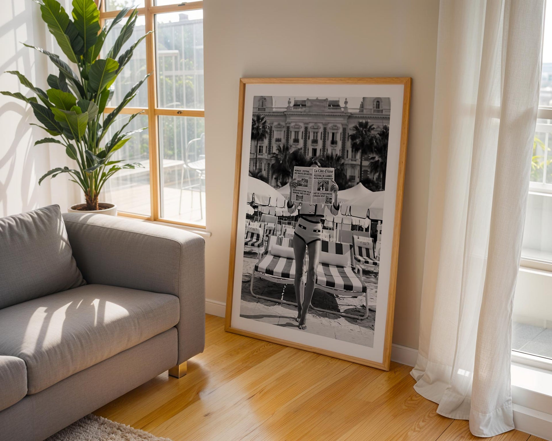
Black and white works exceptionally well in multi-print arrangements because it removes the problem of colour cohesion entirely. Three or four monochrome prints in consistent frames, with compositional variation between them, produces one of the most reliable outcomes in this category. The absence of colour means the eye focuses on what the images actually show rather than on whether the tones match.
For colour arrangements, the palette needs to be genuinely consistent. Prints that are warm-toned but vary significantly in their specific colour register — one leaning orange, another leaning green, another leaning blue — will fight each other on the wall regardless of how well they were individually chosen. Warm Kodachrome-register photography, where the palette is warm and slightly elevated in saturation across all pieces, tends to hang together without effort.
A multi-print arrangement works better when one piece is clearly the anchor: the largest piece, positioned at the visual centre of the arrangement, around which the others are organised. This is the piece the eye goes to first, the piece that establishes the tone for everything else.
Choosing the anchor first and building around it produces more coherent results than selecting all pieces simultaneously. The anchor should be the strongest image — the one you would hang alone if you were only hanging one piece — and the surrounding pieces should support it without competing with it.
An anchor at 50×70 cm with two or three pieces at 30×40 cm is a reliable starting configuration. The size differential is large enough to establish clear hierarchy without the smaller pieces looking like afterthoughts.

Not every wall calls for a multi-print arrangement. In rooms where the walls are not large enough to give a group of pieces the space it needs to breathe, or where the rest of the room is already doing significant visual work, a single strong piece tends to outperform a group.
A quiet luxury interior in particular often reads better with one well-chosen large-format print than with a carefully curated arrangement. The confidence of a single considered piece communicates something different than the thoughtfulness of a group — it implies that the person who chose it did not need more than one image to say what they wanted to say.
The decision between one piece and a group should be based on the wall and the room, not on a default preference. Both approaches work. The failure mode is choosing a group when a single piece would have been bolder, or choosing a single piece when the wall clearly has room for more.
For a first grown-up gallery wall, the approach that produces reliable results: choose two or three prints from a consistent territory — old money, Riviera, or alpine — in a consistent palette. Frame them identically. Position the largest at the centre. Keep the spacing tight and consistent. Give the arrangement enough wall around it to breathe.
That is the whole framework. The complexity comes in the choosing — selecting images that are individually strong and collectively coherent, that share a visual language without repeating themselves, that reward sustained attention rather than depleting quickly.
Each Belora print is produced on museum-quality matte paper with fade-resistant inks, shipped worldwide and produced to order. The collections are organised around exactly the kind of visual consistency that makes multi-print arrangements work — mid-century leisure, coastal, alpine, the register of unhurried confidence that holds a wall the way a considered room holds a conversation.
The grown-up gallery wall is not about having more art. It is about having the right art, arranged with the same intention that went into everything else in the room.


