Cart
0
Free delivery to Sweden in 2–5 business days
Fast and reliable shipping with tracking included.


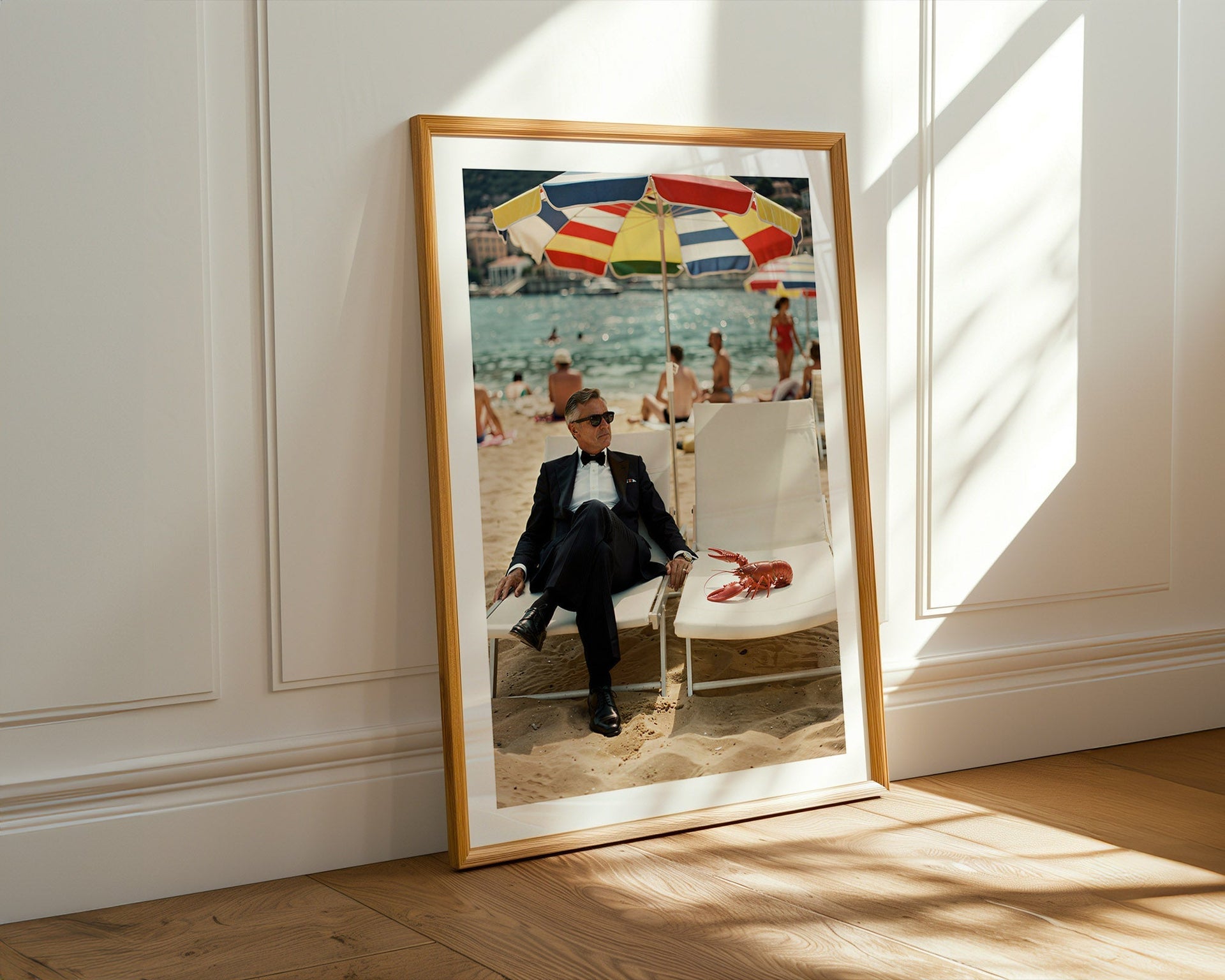
Most French Riviera posters look like they belong in a holiday rental. Turquoise water. A terracotta rooftop. A parasol. The kind of image you have seen so many times that it no longer communicates anything except that the person who chose it wanted something that felt Mediterranean.
The problem is not the subject. The Riviera is genuinely one of the most photogenic stretches of coastline in the world. The problem is what most prints do with it: they reduce it to a postcard.
A postcard tells you where something is. A print worth keeping tells you what it felt like to be there — or more precisely, what it feels like to look at it from across a room, ten years after you bought it.
Understanding that difference changes how you look at wall art altogether.

The Riviera has been photographed continuously since the 1920s. That means two things: there is an enormous archive of genuinely interesting imagery, and there is an even larger body of generic imagery that mimics the archive without capturing any of its feeling.
The generic version tends to have certain signatures. It is usually a landscape composition with no human presence — a harbour, a hillside, a stretch of sea — that communicates location but nothing else. Or, if there are people, they are clearly posed: smiling, aware of the camera, performing the Riviera experience rather than inhabiting it.
Either version looks fine in a shop. It looks considerably less fine on a wall you live with. The landscape version becomes wallpaper within a few months — the eye stops registering it. The posed version dates quickly because it looks like a photograph of someone on holiday, which is interesting to the person on holiday and to almost no one else.
The Riviera prints that genuinely hold a room share a different quality. They have specificity — a particular moment, a particular light, a particular arrangement of things that feels observed rather than arranged. And they usually contain a figure who is not performing.
The most durable images from the golden era of Riviera photography — whether from the 1950s through to the late 1980s — tend to have people in them who are completely occupied with something other than being photographed. A woman reading at a café table with no particular awareness of the lens. A man adjusting the mooring lines on a wooden boat. Someone walking toward the water with the unhurried pace of someone who has walked toward that particular water many times before.
The effect this creates is the opposite of a posed photograph. Rather than drawing your attention to the moment of image-making, it makes you feel like you have been given access to something private — a moment from a life you are not part of, glimpsed without permission. That quality of uninvited observation is what gives these images their pull. You keep looking because there is something to look at beyond the scene itself.
When the figure meets the lens with composure — direct gaze, neutral expression, not acknowledging the absurdity of whatever is happening around them — the image acquires a different kind of tension. It implies that the person has seen stranger things, has been in more interesting rooms, and is mildly unbothered by your observation. That is the specific register of old money ease, and it is the quality that makes Riviera imagery worth having on a wall rather than a screen.

There is a quality of light specific to the Côte d'Azur in the late afternoon — warm without being soft, clear without being harsh — that Kodachrome film captured in a way that has never quite been replicated digitally. The saturation is slightly elevated. The shadows have detail. The whole image reads as slightly warmer than reality, which is why these photographs still feel aspirational rather than documentary.
A Riviera print that captures this quality of light does something useful in a room: it adds warmth without being obviously warm-toned. It lifts the temperature of a space without making an aesthetic argument about it. This is why a well-chosen Riviera print works in a neutral interior where other coloured prints would compete with the palette.
What to look for: highlights that are not blown out, shadows that retain colour rather than going to muddy brown, and a general sense that the image was made in real outdoor light rather than approximating it. In practice this means preferring prints from the mid-afternoon or early evening period rather than those shot in harsh midday light or recreated studio conditions.
A small Riviera print on a large wall is the most common way to undermine an otherwise good image. At A4, most Riviera compositions read as framed postcards — charming as objects, but without enough presence to anchor a room. The image needs space on the wall before it can command the room.
At 50×70 cm, most well-composed Riviera prints begin to read as considered choices rather than incidental decoration. At 70×100 cm, they become focal points — the thing you look at when you enter the room, before you look at anything else.
The Riviera subject matter rewards scale particularly well because the compositions tend to have depth — coastline receding into distance, water that changes colour from foreground to background, architectural detail that only reveals itself when the print is large enough to show it. Buying a Riviera print too small is the single most reliable way to waste a good image.
Riviera prints work particularly well in living rooms and dining rooms where the palette is neutral to warm — the warm Kodachrome tones integrate without announcing themselves. They also work well in studies and reading rooms where a single strong image does the work of a view.
What they tend not to suit: rooms with an already saturated palette, or rooms with a strongly contemporary or industrial aesthetic where the mid-century register of the imagery creates a mismatch. In those contexts, old money wall art in a black and white format tends to work better, sitting outside the question of colour entirely.
One piece, placed correctly, is always preferable to two or three pieces grouped. The Riviera image has enough content to hold a wall on its own. Grouping it with other prints dilutes the effect and moves the arrangement toward gallery-wall territory, which is a different aesthetic register than the one the Riviera imagery is operating in.

The French Riviera runs from Menton in the east to Cassis in the west, and different stretches have entirely different characters. Nice is urban and baroque. Antibes is quieter, more residential. Saint-Tropez has a specific quality of summer excess. Villefranche-sur-Mer is sheltered and painterly — the harbour there has a quality of light that made it a subject for artists throughout the twentieth century.
A print that captures a specific place within the Riviera — rather than a generic Mediterranean coastline that could be anywhere from Greece to Croatia — tends to hold up better over time. The specificity gives it more to say. You look at it and understand where it was made, which gives the image an authority that generic coastal imagery does not have.
The Belora Riviera collection approaches the Mediterranean in this way: each print is located in a particular moment and place rather than a general impression of coastline. The harbour at Villefranche at a specific hour. The Côte d'Azur at the particular quality of late afternoon light that only happens in that part of the world. Each piece is printed on museum-quality matte paper with fade-resistant inks, produced to order and shipped worldwide.
For context on how to place Riviera prints within a broader interior approach — including how they interact with other pieces and why quiet restraint tends to outperform obvious decoration — the guide to old money wall art covers the underlying logic in useful detail.
The best Riviera print is not the one that most obviously says Riviera. It is the one that makes you want to know more about the moment it captured — and keeps doing that every time you walk into the room.


