


Cart
0
There is a particular quality in mid-century leisure photography that is difficult to name directly but impossible to miss once you have seen enough of it. The subjects are doing nothing urgent. The settings are extraordinary by any reasonable measure. And nobody in the image seems remotely interested in either of these facts.
A man reads a newspaper poolside at a villa that would cost thirty million today, wearing the expression of someone waiting for a bus. Two women play backgammon on the deck of a yacht moored off a coastline that looks like a painting, and neither of them is looking at the coastline. Someone in a dinner jacket tends to a drink at an elevation that makes most people dizzy, and the drink appears to require his full attention.
This is the aesthetic of ease. Not performed ease — the kind that appears in luxury advertising, where beautiful people are very deliberately relaxing in expensive settings — but the genuine article: people for whom the extraordinary has become ordinary through long exposure. The pool is simply where they swim. The yacht is how they get from one place to another. The dinner jacket is what one wears.
It is this quality — total composure in the face of the spectacular — that defines the visual tradition this aesthetic draws from, and that makes it so durable as a source for wall art.

The visual grammar of mid-century leisure
The mid-century leisure aesthetic has a specific visual grammar that distinguishes it from adjacent traditions. Understanding the grammar is what separates prints that genuinely carry the quality from prints that approximate the surface without capturing the feeling.
The protagonist does not perform. This is the foundational rule. The subject of any image in this tradition is either unaware of being photographed — genuinely occupied with something else — or meeting the camera with complete composure and zero acknowledgment of what that camera represents. There is no smile for the lens. There is no awareness that the setting is remarkable. The moment a subject begins to perform, the image shifts from evidence of a life to documentation of a moment, and the quality that makes it interesting disappears.
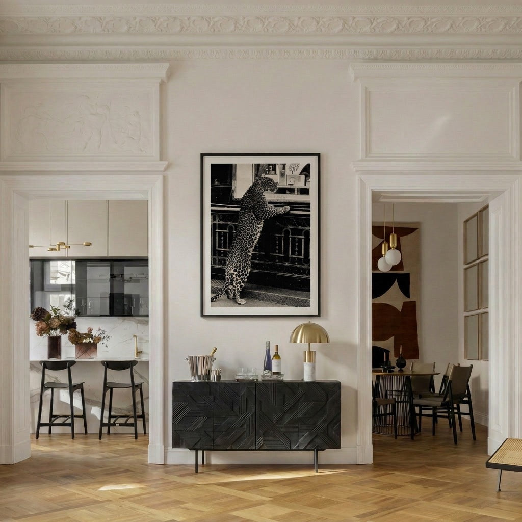
Something is always slightly wrong. The best images in this tradition have one element that does not quite belong — an incongruity that the protagonist is treating as entirely unremarkable. The champagne at altitude, served by someone in a tuxedo, at a table that seems to have been set up on a ski slope for no particular reason. The animal that has wandered into a domestic scene and is being accommodated without comment. The formal occasion in an improbable setting. This is the "wrong thing in the right place" logic that gives these images their staying power: there is always something to notice, something to wonder about, something the image declines to explain.
The light is period-correct. Mid-century leisure imagery has a specific quality of light — warm without being golden, clear without being harsh, slightly elevated in saturation in a way that reads as 1970s without announcing it. This is the Kodachrome register, and it is what gives these images their sense of temporal distance. They are clearly from another era, but they are not trying to look old. They are simply themselves, in their own light.
The setting is implied rather than stated. Strong images in this tradition do not photograph the setting as scenery. The coastline is glimpsed behind the figure, not centred. The villa is out of frame except for the detail that places you inside it. The mountain is context, not subject. This compositional choice does something important: it suggests that the person in the image is so accustomed to the setting that they no longer notice it, which communicates more about the life being depicted than any direct establishing shot could.
Why this aesthetic endures
The mid-century leisure aesthetic has been continuously influential in interior design for decades, and the reasons are worth understanding because they explain why it works as wall art specifically rather than as imagery in general.
First, it communicates aspiration without effort. The images depict lives that are clearly desirable without making any argument for why they are desirable. There is no glamour, no drama, no visual persuasion. The life simply exists in the frame, and the viewer draws their own conclusions. This passive quality is what makes the images liveable over time — they do not demand a particular response, which means they can be looked at indefinitely without depleting.
Second, the period distance creates a particular kind of comfort. These images are clearly from another era — the clothes, the cars, the quality of the light — but the era is close enough to feel continuous with the present rather than historical. The 1960s and 1970s are within living memory for many people, and the visual register of that period has been so thoroughly aestheticised that it now reads as timeless rather than dated. It does not look old the way Victorian imagery looks old. It looks like a particular way of seeing.
Third, the aesthetic has a consistent moral logic that resonates with contemporary values in interior design. It is anti-performative. It values quality over display. It is indifferent to trends. These are exactly the qualities that the quiet luxury aesthetic is built on, which is why mid-century leisure imagery integrates so naturally into quiet luxury interiors.

What the imagery works in
The mid-century leisure aesthetic translates into wall art with a flexibility that most subject categories do not have. It works in living rooms and dining rooms, in studies and reading rooms, in bedrooms and entrance halls. It works in warm palettes and in neutral ones. It works at large format — 70×100 cm and above — where it has the scale to anchor a room, and at medium format — 50×70 cm — where it serves as a considered accent.
What it does not work in: rooms that are already doing significant visual work in a competing direction. Contemporary, highly graphic, or industrial aesthetics are the contexts where mid-century leisure imagery tends to create mismatch rather than contrast. In those rooms, black and white photography in the same tradition can bridge the gap — the monochrome removes the question of period and palette while preserving the compositional and subject-matter qualities that make the images interesting.
The specific collections that carry this aesthetic most consistently are the ones built around the classic leisure territories: alpine, coastal, poolside, the particular quality of life at altitude or by warm water that mid-century photography captured so well. The Riviera collection and the alpine collection both operate in this register — warm light, unhurried subjects, settings that are implied rather than stated.
Choosing within the tradition
When selecting art from this visual tradition, the questions to ask are not primarily about subject matter or style. They are about the specific qualities that make an image genuinely belong to the tradition rather than approximating it.
Does the protagonist look like they belong where they are? Not comfortable — belonging. Comfort can be performed. Belonging is structural. The person who belongs in the setting treats it as background, not as context.
Is there something to notice? Something that does not quite fit, that the image declines to explain, that rewards a second look? The images that work over time have this quality. The images that deplete quickly are the ones where everything is exactly as it appears.
Does the image have depth — compositional, tonal, narrative? Is there something happening in the middle ground or the background that the image is not drawing attention to? A detail that reveals itself on the third viewing rather than the first?
These are the qualities that make mid-century leisure photography worth living with rather than simply worth acquiring. The Belora old money collection is built around exactly these criteria — prints with the specific quality of ease that defines the tradition, produced on museum-quality matte paper with fade-resistant inks, shipped worldwide.
The art of doing nothing well is not a minor skill. It takes generations of practice, and a very particular quality of confidence. The photography that captures it best does not try to explain it. It simply shows you what it looks like — and lets you decide what to do with that.


