
Cart
0
What Old Money Actually Means
Old money is not a price point. It is not a colour palette. It is not even, strictly speaking, about money at all.
It is a relationship with objects — one that prioritises permanence over novelty, quality over display, and restraint over abundance. The old money aesthetic in interior design is the visual expression of that relationship: rooms that look as though they were assembled over decades, not furnished in a weekend. Spaces where everything has a reason to be there, and nothing is trying too hard.
It is the opposite of aspirational in the conventional sense. The aspiration here is not to have more. It is to have exactly the right things, chosen carefully, kept indefinitely.
The Principles, Not the Rules
Interior design guides tend to reduce old money to a checklist: neutral palettes, natural materials, antiques, silver frames. These are symptoms, not causes. Understanding the principles behind the aesthetic produces more coherent results than copying the surface.
Permanence. Old money rooms are built to last. Nothing is chosen because it is fashionable. Everything is chosen because it will still be right in twenty years. This applies to furniture, textiles, and art. The question is not "does this look good now?" but "will this still be correct in a decade?"
Restraint. Fewer things, better things. Old money interiors are never cluttered — not because they are minimalist, but because each object has earned its place. A room with twelve pieces of art on the wall is a gallery. A room with three is a statement.
Depth. The aesthetic requires layers of time — books that have been read, furniture that shows use, art that was collected rather than purchased. This is the hardest element to fake, and the most important one to understand. A room that looks too new, too coordinated, too recently assembled will never achieve the effect, regardless of budget.
Confidence. Old money does not explain itself. The room does not announce its influences or justify its choices. It simply is.

The Role of Art in an Old Money Interior
Art is the single most important element in an old money room — more than furniture, more than textiles, more than architectural detail. It is the first thing that communicates whether a space has a point of view or merely a budget.
The wrong art — generic, trend-driven, decorative without substance — undoes everything else. The right art ties the room together and communicates something about the person who lives there.
Old money art is not necessarily expensive. It is specific. A print that references a particular world — a specific geography, a specific era, a specific sensibility — carries more weight than an abstract that was chosen to match the sofa. The subject should say something. The framing should be considered. The scale should be committed to.
For rooms built around the old money aesthetic, Belora's old money wall art collection is the most direct starting point — curated specifically around the aesthetic's visual grammar. Beyond that, the Alpine collection references the world of Gstaad and St. Moritz — the Swiss resorts that defined European wealth for decades. The Riviera collection reaches for the Côte d'Azur — Cannes, Monaco, Villefranche. The Palm Beach collection is the American equivalent: Worth Avenue, Atlantic-facing estates, the social season.
These are not decorative references. They are cultural ones. And in a room where the rest of the choices have been made with the same level of intention, they land accordingly.
Colour, Materials, and Light
The old money palette is built on neutrals — but not the cold, grey-white neutrals of Scandinavian minimalism. The reference point is warmer: bone, cream, aged linen, warm taupe, dark walnut, faded tobacco leather. The palette of rooms that have existed long enough to develop a patina.
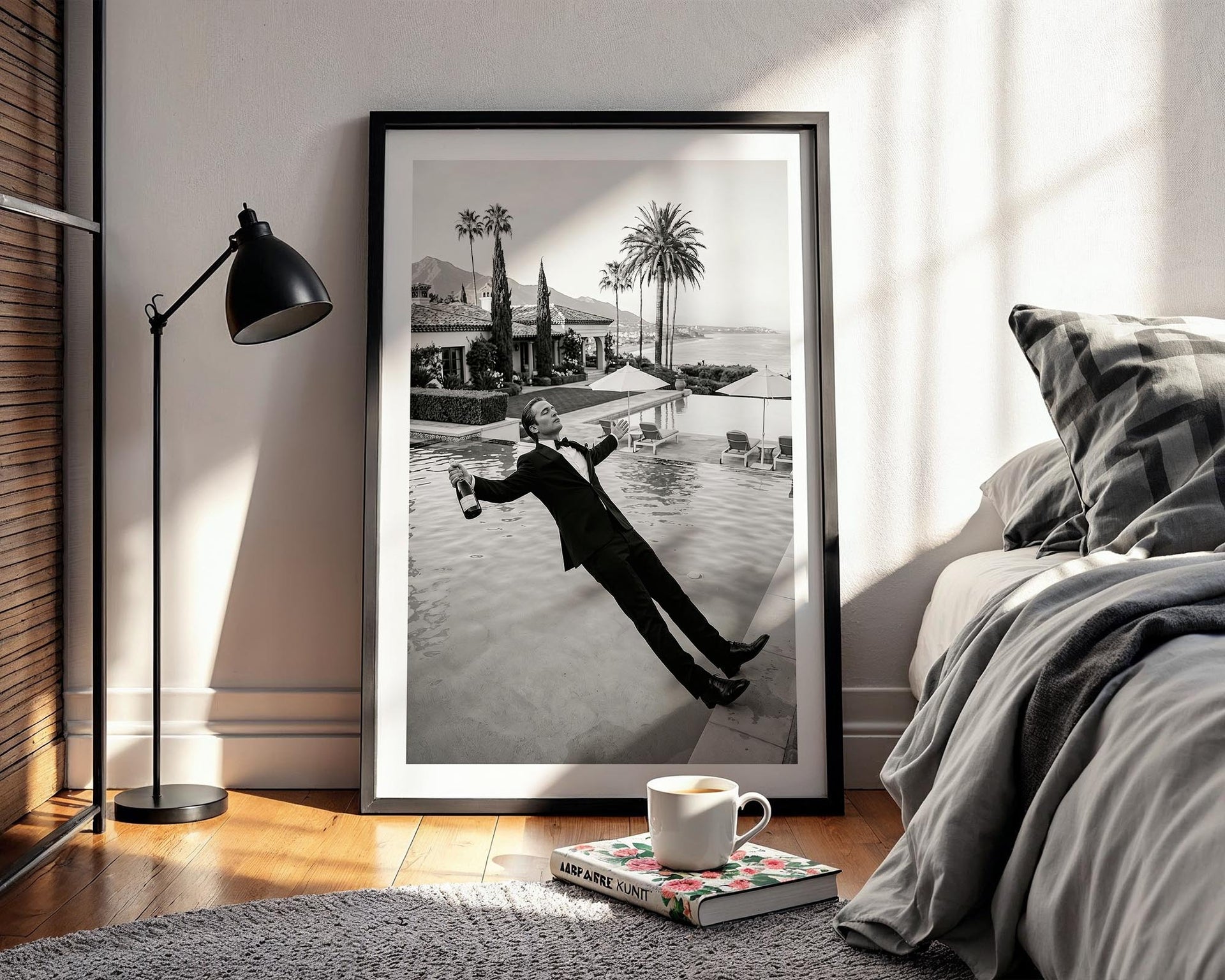
Against these tones, black and white art operates with particular authority. A monochrome print on warm white walls is not a contrast — it is a continuation. The tonal range of the print deepens the room without disrupting its warmth.
For materials, the principle is natural over synthetic, aged over new. Linen and wool over polyester. Stone and plaster over tile and composite. Solid wood over veneer. These choices are not about cost — many synthetic materials are more expensive than their natural equivalents. They are about the quality of presence that natural materials bring to a room over time.
Light should be warm and layered. Table lamps, reading lights, candles — not overhead lighting. Old money rooms are lit for habitation, not inspection.

The Walls
In an old money interior, walls are not backgrounds. They are part of the composition.
A single large-format print — 70×100 cm or 100×140 cm — hung at eye height above a console or sideboard functions as an anchor. It gives the room a focal point and establishes the register for everything else. The furniture, the objects, the lighting — all of it orients around the art.
For gallery walls, the old money approach is not the maximalist grid of forty prints at identical spacing. It is a considered arrangement of three to five pieces — varying sizes, related subjects, unified by frame colour or aesthetic thread. It looks assembled. It looks as though each piece arrived at a different moment, for a different reason, and found its place.
The frame matters. A simple black frame on a monochrome print is the most versatile choice — it works in almost any interior context without asserting itself. Natural wood is warmer and more appropriate for rooms with organic, earthy tones. Never ornate. Old money frames are confident, not decorative.
What to Avoid
The old money aesthetic fails most often not through the wrong choices, but through too many right choices made too quickly. A room furnished entirely in old money references — every object coordinated, every surface deliberate — reads as theatrical rather than authentic. The aesthetic requires the appearance of accumulation. If everything arrived at once, it shows.
Avoid trend adjacency. The old money aesthetic is currently fashionable, which means there is a version of it that is entirely trend-driven — the same prints, the same furniture, the same arrangement reproduced across Instagram and Pinterest. The way out of this is specificity. Choose art that references a world you actually find compelling. Choose objects that have a reason to be there beyond aesthetics.
Avoid over-explanation. Old money rooms do not have themes. They have perspectives. A room that announces itself — all alpine prints, all horse-racing memorabilia, all one thing — is a collection, not a home.
The Room at the End
The old money aesthetic, done well, produces a room that is impossible to date. It could be 1985 or 2025. It belongs to someone with a point of view, a tolerance for permanence, and no particular interest in what is currently fashionable.
That room starts with a decision about the walls.
Explore Belora's old money wall art collection — or browse by territory: Alpine, Riviera, Palm Beach, and Black & White.


