
Cart
0
The Hardest Room to Get Right
Minimalist rooms are unforgiving. When a space contains very little, everything that is there carries disproportionate weight. A chair in an empty room is not just a chair — it is a statement about proportion, material, and intention. The same logic applies, more urgently, to art.
In a maximalist interior, a weak print disappears. In a minimalist room, it dominates. This is why so many minimalist spaces end up with bare walls — not because the occupant prefers them that way, but because the stakes of the wrong choice feel too high.
The answer is not to avoid art. It is to choose it with the same rigour applied to everything else in the room.
One Print, Done Correctly, Is Enough
The first principle of wall art in a minimalist interior is commitment to singularity. One strong print, correctly scaled and correctly placed, is more resolved than three adequate ones.
This runs counter to the instinct most people have when decorating — to fill space incrementally, to hedge with multiple smaller pieces rather than committing to one large one. In a minimalist room, that instinct produces clutter rather than preventing it. Three small prints on a large wall reads as indecision. One large print reads as intention.
The print you choose for a minimalist room should be able to hold the wall on its own. If it cannot — if it needs supporting pieces to feel resolved — it is not the right print for the space.
Scale: Larger Than You Think
The most common mistake in minimalist interiors is under-scaling the art. A small print on a large wall does not feel restrained. It feels absent.
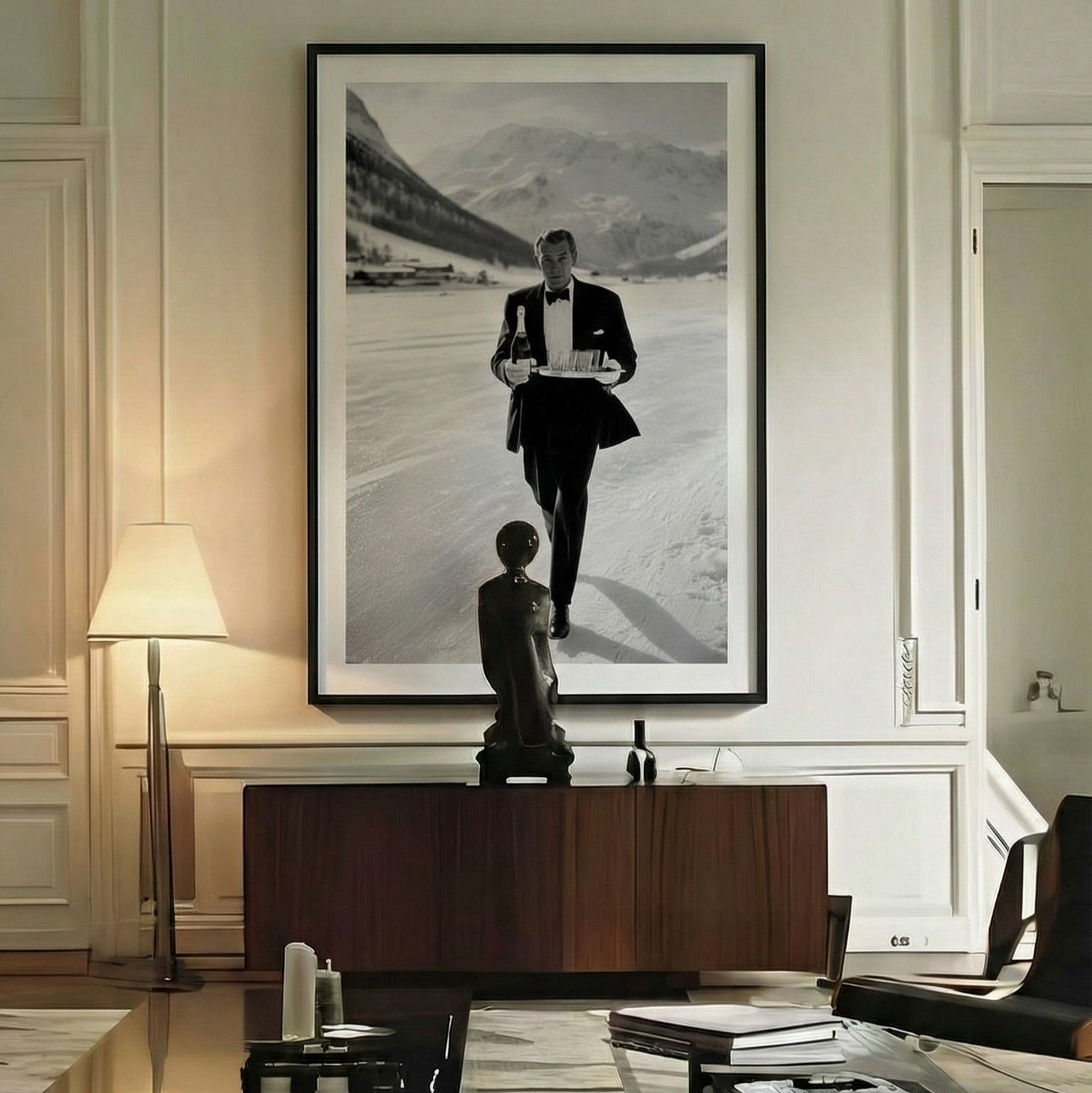
For a minimalist living room, the anchor print should be 70×100 cm at minimum. In rooms with high ceilings or long walls — above a sofa, above a fireplace, as the single focal point of an entryway — 100×140 cm is the more resolved choice. At that scale, the print becomes a presence rather than a decoration. It occupies the wall the way furniture occupies the floor.
The hesitation around large format is usually about cost and commitment. Both are valid. But a single large print on archival paper is a permanent addition to a room — not a trend decision, not a seasonal change. The commitment is the point.

Subject Matter: Specific Over Abstract
Abstract art is the default choice for minimalist interiors, and it is usually the wrong one. Not because abstract art cannot work in a minimal space — it can — but because the reasoning behind the choice is often aesthetic rather than intentional. Abstract prints are chosen because they feel safe, because they will not clash, because they do not assert too much.
In a minimalist room, a print that does not assert anything reads as empty. The space is already quiet. The art needs to say something.
Figurative and photographic prints — a single strong subject, clear composition, strong tonal contrast — perform better in minimal interiors precisely because they have a point of view. A woman on a Monaco poolside. A Porsche on an alpine road. A figure on the bow of a wooden Riva. These images bring a cultural register into the room that an abstract cannot.
The subject should be specific enough to reference a world, and restrained enough not to overwhelm a quiet space. This is exactly the territory that Belora's black and white collection occupies — figurative, photographic, compositionally strong, and designed to hold in a room where it is the only thing on the wall.
Colour: The Case for Monochrome
In a minimalist room built around a neutral palette — white, warm grey, bone, concrete — a black and white print is the most resolved choice. It does not introduce a colour that needs to be balanced elsewhere in the room. It adds contrast and depth without disrupting the palette.
The tonal range of a well-produced monochrome print — deep shadows, clean highlights, a full spectrum of grey between them — adds more visual complexity to a minimal space than most colour prints do. The eye moves through the image rather than simply registering it.
For rooms with a warmer palette — aged linen, dark walnut, terracotta — a warm-toned colour print can work with equal authority. The key is that the print's palette should sit within the room's rather than competing with it. One dominant colour in the image that echoes a tone already present in the space is the simplest test.

Placement: Where the Print Goes
In a minimalist room, placement is as deliberate as the choice of print. The wall is not a background — it is part of the composition. Where the print sits within that composition matters.
Eye height is the baseline. The centre of the print should sit at approximately 145–150 cm from the floor — the average eye height when standing. This is the rule for a reason: it is the height at which the image is seen most naturally, without requiring the viewer to look up or down.
Above furniture, the gap between the top of the piece and the bottom of the frame should be 15–20 cm. Closer than that, the print feels attached to the furniture rather than belonging to the wall. Further than that, the relationship between the two breaks down entirely.
In a minimalist room with no furniture on a given wall — an entryway, a corridor, a bedroom wall opposite the bed — the print can sit slightly higher, at 155–160 cm centre height. The eye level when moving through a space is slightly higher than when seated, and the print should meet it accordingly.
Framing in a Minimal Interior
The frame is a design decision, not an afterthought. In a minimalist room, where every element is visible and considered, the wrong frame undermines the right print.
The most versatile choice for a minimalist interior is a simple black frame with a white mat. The frame recedes. The mat creates breathing room between the image and its border, which is particularly important at large format — without a mat, a large print in a thin frame can feel pressured rather than considered.
For rooms with warmer tones, a natural oak or walnut frame works with equal authority. It brings organic warmth into the space without competing with the print's content.
Avoid ornate, gilded, or distressed frames in a minimalist context. They introduce a decorative layer that the room has specifically excluded everywhere else.
Belora's framed prints are available from A4 to 50×70 cm, mounted in a simple black frame with white mat — ready to hang, no additional decisions required. For larger formats, unframed prints on archival matte paper are equally resolved against a minimal wall.
The Gallery Wall in a Minimalist Room
A gallery wall is not inherently at odds with minimalism — but it requires stricter editing than in any other interior context.
Three prints maximum. Ideally from the same collection, or prints that share a strong tonal and compositional logic. The same frame on every piece. Consistent spacing — 4 to 5 cm between frames, no more. The arrangement should read as a single considered unit, not as a collection of individual decisions.
The Alpine and Riviera collections both contain monochrome prints that work together in exactly this way — different subjects, shared aesthetic register, the same photographic grammar. Three prints from either collection, framed identically, form a gallery wall that holds in a minimalist space without disrupting it.
The Single Decision That Changes the Room
A minimalist room without art is a room waiting to become something. The right print — correctly scaled, correctly placed, with a subject that says something — is the decision that completes it.
Not because it fills a wall. Because it gives the room a point of view.
Browse the prints most suited to minimalist interiors: black and white wall art, Alpine collection, Riviera collection, and old money wall art — all at Belora & Co.


