Cart
0
Free delivery to Sweden in 2–5 business days
Fast and reliable shipping with tracking included.


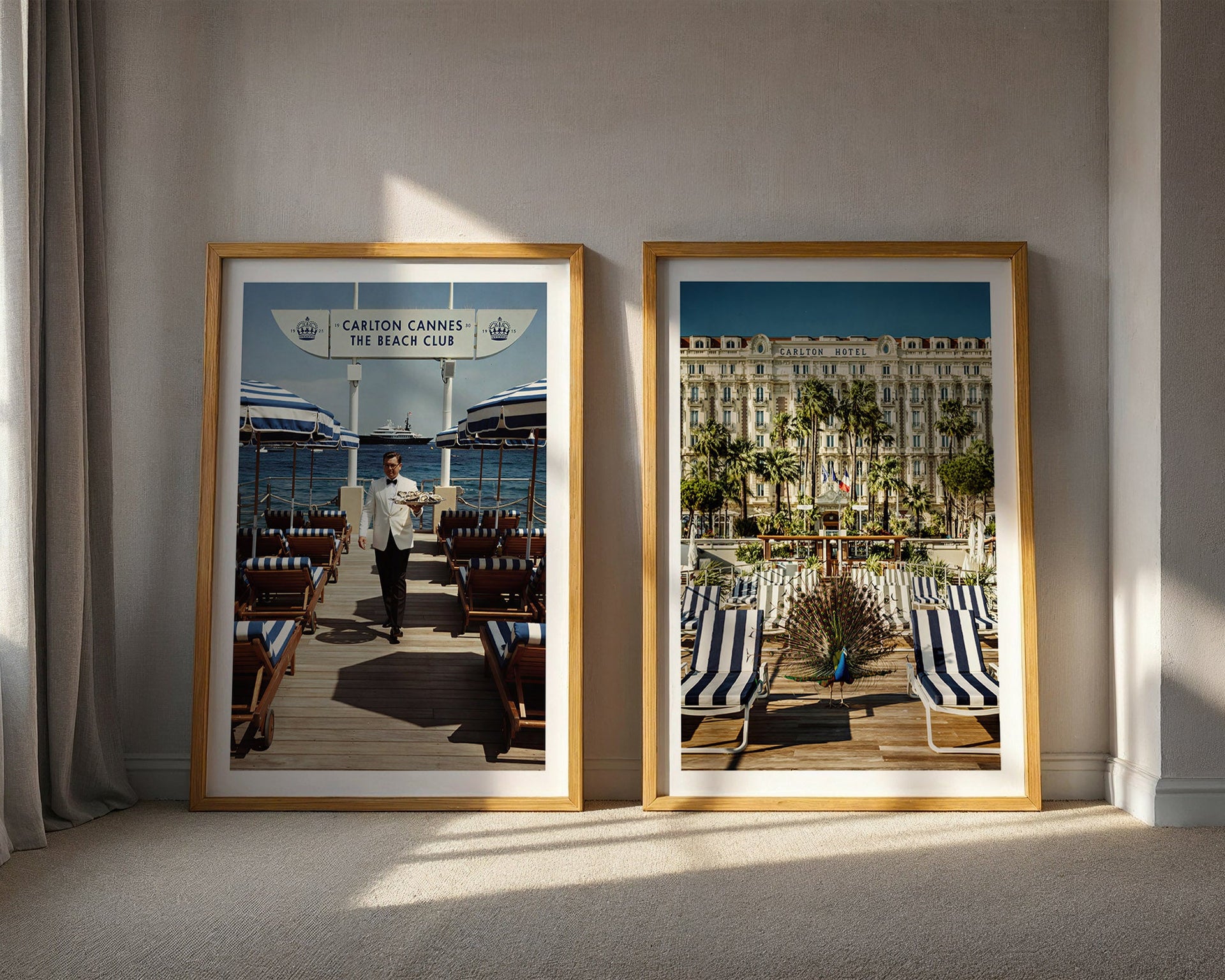
Most people choose art for the living room last. The sofa, the rug, the lighting, the cushions, the side tables — all of it decided, purchased, arranged — and then the walls are addressed as a final step, usually with a budget that has been spent down and a decision-making energy that has been exhausted.
This is the wrong order. Art should be chosen first, or at minimum alongside the major decisions, because it sets the emotional register of the room. It is the element that gives the space a point of view. Everything else is furniture.
But most guides to choosing living room wall art approach the question the wrong way — as a series of rules about size, colour matching, and hanging height that reduce a genuinely complex aesthetic decision to a technical checklist. This is a different approach. It starts with the room you actually want to be in, and works backward to the art that creates it.

Before considering size, format, or subject matter, the useful question is: what do you want to feel when you walk into this room? Not what do you want the room to look like — that is a secondary question — but what emotional register should the space operate in?
Calm and grounded. Aspirational and expansive. Warm and personal. Quietly confident. Each of these registers implies a different kind of art, and getting the register right matters more than any specific aesthetic choice within it.
The mistake most people make is choosing art based on what they like looking at in isolation — in a gallery, on a website, on a phone screen — rather than what they want to live with. These are different questions. An image that is striking as a single encounter may be depleting as a daily presence. An image that seems understated on a screen may be exactly right at scale on a wall, because it has depth that only reveals itself over time.
Art worth living with tends to reward sustained attention without demanding it. It offers something on the fourth viewing that was not visible on the first — a detail in the background, a quality of light, a tension between elements that the image does not resolve. This is the quality to look for, and it is only perceptible when you spend time with an image rather than selecting it quickly.
Size is where most living room art choices go wrong, and almost always in the same direction: too small. A print that is the right image at the wrong size does not produce a smaller version of the effect it would have at the right size. It produces a different effect entirely — one that reads as cautious rather than considered, provisional rather than committed.
The useful test: stand in the room and look at the wall where the art will hang. What size would a piece need to be to hold that wall — to have genuine presence without overwhelming the space? That is your starting point. Now go one size larger than your instinct suggests. The instinct toward caution is almost always wrong in this direction.
For a standard living room wall, a single piece at 70×100 cm is the minimum to read as a considered choice rather than a placeholder. At 50×70 cm, a piece needs to be part of a larger arrangement or positioned on a smaller wall to avoid reading as undersized. A4 and 30×40 cm work in specific contexts — a study, a bathroom, a narrow wall — but are rarely the right choice for a primary living room wall.
A single large piece almost always outperforms multiple smaller pieces on the same wall. The confidence of one strong image communicates more than the industry of several smaller ones. If the wall has room for more than one piece, the question should be whether a group arrangement genuinely works — whether the pieces have the visual coherence to function as a whole — rather than whether more pieces would fill the space.

The most important quality in living room art is longevity — the capacity to be looked at daily for years without depleting. This narrows the category considerably.
Abstract art without clear subject matter tends to deplete faster than figurative or narrative imagery, because there is less to return to. The initial encounter may be strong, but once the eye has mapped the composition, there is nowhere new to go. Strong abstract work is an exception, but it requires a level of quality and intention that most decorative abstract prints do not have.
Trend-driven imagery depletes fastest of all. Work that reads as contemporary in a specific moment — that signals awareness of current aesthetic conversations — dates when those conversations move on, and it dates quickly. The living room is the wrong place for trend-responsive art.
Figurative photography with specificity — a particular moment, a particular person, a particular quality of light that is clearly from somewhere real — tends to have the greatest longevity. The specificity gives the image more to offer on repeated viewing. You keep looking because there is something to look at beyond the surface.
The mid-century leisure tradition is particularly strong in this regard: the images have narrative depth, the subjects have the specific quality of people who are genuinely inside their lives rather than posing for documentation, and the period distance gives the imagery a timelessness that more contemporary photography rarely achieves. The old money collection, the Riviera collection, and the alpine collection are all built within this tradition.
The decision between colour and monochrome is less about aesthetic preference and more about what the room needs. Colour photography in a warm register — the Kodachrome palette of mid-century leisure imagery — adds warmth to a neutral interior without competing with an existing colour scheme. It works naturally in rooms where the palette is restrained and the art is invited to be the warmest element.
Black and white photography works in almost any palette because it removes itself from the colour conversation. A strong monochrome image can sit in a warm room, a cool room, or a highly saturated room without creating conflict. It contributes through composition and subject matter rather than through colour, which makes it the more versatile choice when the room's palette is already doing significant work.
For a first piece in a living room where the colour decisions are not yet fully settled, black and white is the lower-risk choice. For a room where the palette is warm and the art is intended to contribute to that warmth, colour photography in the right register is more rewarding.
Framing matters more than most people expect, and the default choices — whatever frame the print shop offers, whatever matches the existing furniture — are usually the wrong ones.
For art in the mid-century leisure or quiet luxury register, the frame should be simple: solid wood, clean profile, natural or dark finish. No ornament, no metal, nothing that competes with the image. The frame's job is to finish the piece and separate it from the wall, not to be noticed as an object in its own right.
Consistent framing across multiple pieces in the same space is almost always better than varied framing. The consistency communicates intention: these pieces were chosen together, for this room, with a point of view about how they should be presented. Varied frames communicate assembly: these pieces were acquired at different times, for different reasons, and share a wall by proximity rather than by design.

The practical conclusion from all of this is deliberately simple: choose one piece for the main wall of your living room. Choose it with genuine conviction — based on sustained consideration, not first impression. Scale it appropriately, which means larger than your instinct suggests. Frame it simply. And give it the wall it needs to breathe.
That single decision, made well, will do more for the room than any other choice you make in it. It is the decision that gives the space its character. Everything else is in service of the room this one piece creates.
Each Belora print is produced on museum-quality matte paper with fade-resistant inks, shipped worldwide within 2–5 days and produced to order. The collections are curated around a consistent visual standard — mid-century leisure photography with the specific qualities of depth, specificity, and unhurried confidence that make art worth living with rather than simply worth having.


