
Cart
0
Why Black and White Never Goes Out of Style
Some design choices age. Others simply don't. Black and white wall art belongs to the second category — a combination so fundamental to visual composition that it has defined everything from mid-century modernism to the quiet luxury interiors of today.
There is no trend cycle here. Monochrome is not having a moment. It has always been there, quietly anchoring the rooms that know what they are doing.
The Logic of Monochrome
Colour invites opinion. It asks you to commit — to a mood, a season, a decade. Black and white removes that pressure entirely. A well-chosen monochrome print works in a Scandinavian apartment, a Georgian townhouse, and a mid-century home office with equal authority. It does not compete with the furniture. It elevates it.
For interiors built around neutral palettes — bone, cream, warm grey, dark walnut — a black and white print is not a safe choice. It is the confident one. It adds contrast without chaos and atmosphere without effort.

What Makes a Black and White Print Worth Hanging
Not all monochrome art is created equal. The difference between a black and white print that feels gallery-worthy and one that simply feels absent comes down to three things: composition, tonal range, and subject matter.
-
Composition is everything. A strong single focal point — a figure, a silhouette, a car, a horizon — gives the eye somewhere to land. Busy or symmetrical compositions tend to flatten when colour is removed.
-
Tonal range determines depth. A print that only uses two shades — pure black and pure white — loses the dimension that makes art feel alive. The best monochrome prints move through a full spectrum of grey, with deep shadows and clean highlights that create genuine contrast on the wall.
- Subject matter carries the emotional weight. In a luxury interior, the subject should say something. Vintage figures, architectural details, and atmospheric landscapes carry inherent prestige. Decorative abstracts rarely do.
Black and White Art in the Home: Room by Room
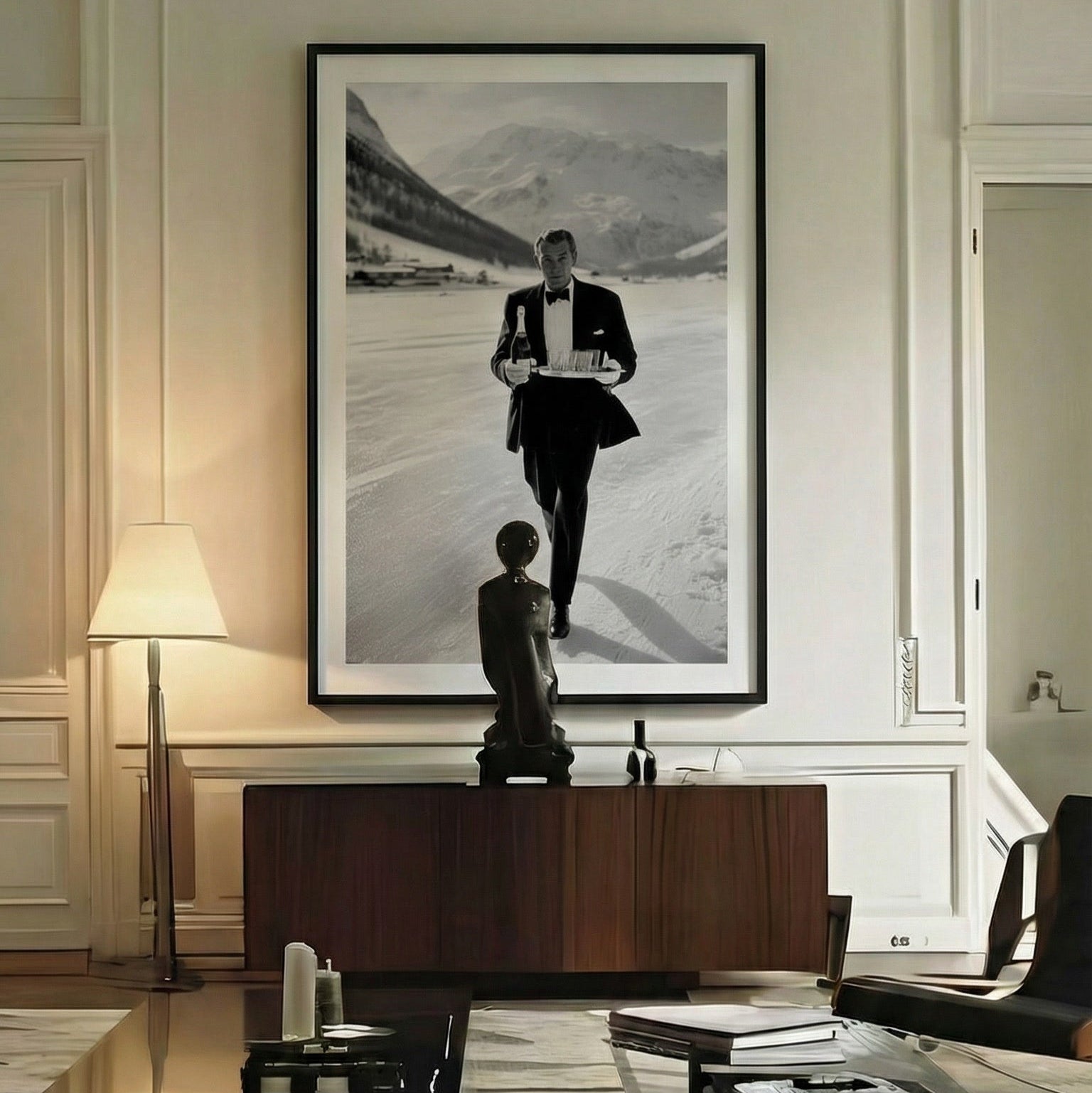
The living room is where a large-format black and white print performs best. Above a sofa or console table, a 50×70 or 70×100 cm piece becomes the room's point of reference — the thing that makes the rest of the space cohere. Against a neutral or dark wall, the contrast is immediate.
-
The home office responds well to monochrome. Without colour distraction, the space reads as more focused and intentional. A strong figurative print — something with a point of view — adds identity to a room that might otherwise feel purely functional.
-
The bedroom benefits from restraint. Black and white works precisely because it does not excite. It creates atmosphere without stimulation — which is exactly what a space designed for rest should do.
- Hallways and entryways are underused. A single strong black and white print in a narrow corridor transforms a transitional space into one with intention. First impressions are set by what is on the walls.
The Framing Question
A black and white print presented unframed on museum-quality matte paper carries its own weight. The matte surface absorbs light rather than reflecting it, which deepens contrast and gives the tones an almost photographic permanence.
Framed in black or natural wood, the same print steps into gallery territory. The frame creates a boundary between the artwork and the wall — a separation that signals deliberate curation rather than casual decoration. For rooms that already have strong architectural detail, a simple black frame is often enough.

Prints Worth Owning
At Belora & Co, the black and white collection is built around the same principle that defines the brand: a single strong subject, a considered composition, and a production standard that holds at the largest sizes.
Every print is produced on archival giclée paper — the same standard used in museum editions — with fade-resistant inks that preserve tonal depth over time. These are not decorative placeholders. They are permanent additions to a room.
The difference is visible. And after a while, it becomes impossible to imagine the wall without them.
Explore the full black and white collection at Belora & Co.


