
Cart
0
The Wall That Changes the Room
Most living rooms have one. A stretch of wall above the sofa, beside the fireplace, or facing the door — the kind of space that seems to resist every attempt at decoration. A single print feels lost. Nothing feels right. So it stays empty, which feels worse.
A gallery wall solves that problem. Not by filling space, but by creating intention. Done well, it transforms the largest blank surface in the room into the thing that anchors everything else — the piece of a room that visitors notice first and remember longest.
Done poorly, it looks like a collection of frames that arrived separately and never quite agreed on what they were doing.
The difference is curation, not budget.
Start With a Unifying Idea, Not a Frame Count
The most common mistake with gallery walls is starting with the frames. Before anything goes on the wall, you need a thread — the logic that connects each piece and makes the arrangement read as a single statement rather than a group of strangers.
That thread can be a colour palette. A subject matter. A period in time. An aesthetic that runs through every piece — even the ones that look very different from each other.
For a living room with a neutral base — bone, warm grey, natural linen — a monochrome gallery wall is one of the most resolved options available. Black and white prints from different subjects hold together visually because the tonal language is shared. You can mix architectural photography, figurative work, and landscape within the same arrangement and it will cohere.
For rooms with more colour, the approach inverts: the frames provide the unity. A consistent frame — all black, all natural wood, all the same depth — lets the art within them range more freely without the wall feeling chaotic.

Choosing the Right Prints for a Gallery Wall
Not every print is designed to work alongside others. For a gallery wall to succeed, each piece needs to do two things simultaneously: hold its own, and recede when necessary.
Prints with a single strong focal point — a figure, a landscape, a clearly defined subject — work better in gallery arrangements than compositions with too much visual complexity. The eye needs somewhere to land in each frame, then somewhere to travel next.
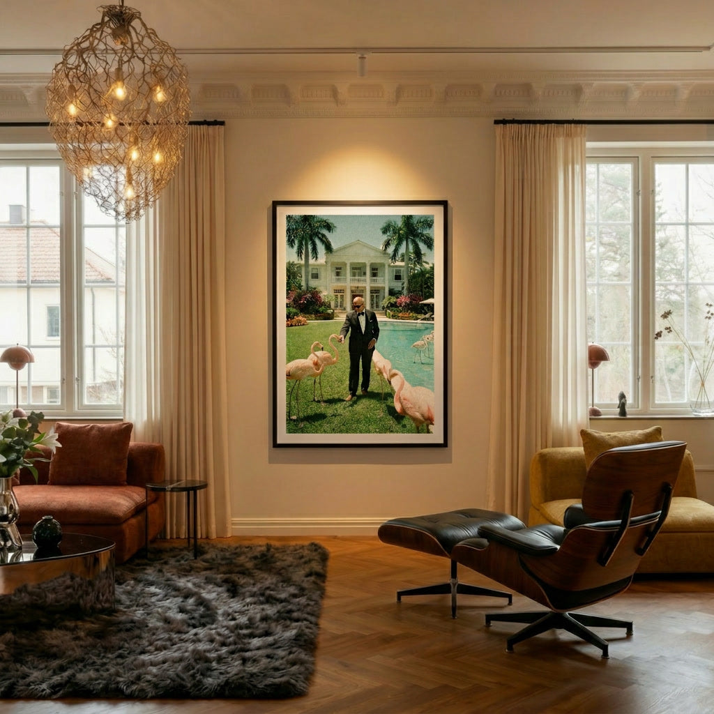
At Belora, the collections are built around exactly this logic. A print like Tennis Court Morning in LA — a single figure, clean light, architectural geometry — sits comfortably alongside a different scale and subject. So does LA Hillside Villa, where the composition is strong enough to anchor a corner while leaving room for smaller pieces nearby.
The Alpine collection and the Palm Beach collection work particularly well together in a gallery format — different subjects, shared aesthetic register, warm and aspirational in the same key.
Sizing: The Decision Most People Get Wrong
Gallery walls fail most often at the size stage. The instinct is to use small prints — easier to move, less commitment, lower cost. The result is a wall of postage stamps that makes a large room feel smaller and more cluttered, not more considered.
For a living room gallery wall, the anchor print should be larger than feels comfortable before you hang it. A 50×70 cm or 70×100 cm piece as the centrepiece gives the arrangement a clear hierarchy and prevents the whole wall from reading as decoration rather than art.
Smaller formats — A4 and 30×40 — work as supporting pieces around that anchor. They add rhythm and variation without competing for attention. The ratio to aim for is one large piece for every two or three smaller ones.
Framed pieces add structure and weight. An unframed large-format print on matte archival paper reads differently — more relaxed, more editorial. Both approaches work in a living room, but they create different moods. Framed compositions feel more permanent and deliberate. Unframed arrangements feel more like a working collection, one that might expand.
Layout: Plan on the Floor Before You Touch the Wall
The floor is the most useful tool in gallery wall planning. Lay every print out on the floor in front of the wall you intend to use. Arrange them until the spacing feels right, the hierarchy is clear, and nothing is competing directly with anything else.
The paper template method adds precision: cut paper to the exact dimensions of each print, tape the outlines to the wall, and live with the arrangement for a day before committing. It costs nothing and prevents the most expensive gallery wall mistake — unnecessary holes.
For spacing, the most versatile range for living rooms is 3 to 5 cm between frames. Tighter than that, the arrangement reads as a grid, which works only when the prints themselves are very uniform. Looser than that, the pieces begin to feel unrelated — the gallery effect disappears and you are left with individual prints that happen to share a wall.

Three Gallery Wall Approaches for a Living Room
The Anchor and Support. One large print — 70×100 or 100×140 cm — positioned at eye height as the clear centrepiece. Two or three smaller prints to one side or below, asymmetrically placed. The simplest approach, and often the most resolved. Works especially well above a console table or a sideboard where the furniture provides a visual base.
The Considered Grid. Four to six prints of the same size, spaced evenly, in two rows. Requires the most discipline at the selection stage — every piece needs to be strong enough to hold in isolation, and the overall palette needs to be tight. Looks best in a room with clean architectural lines.
The Collected Wall. Varied sizes, varied subjects, built over time. The hardest to execute well and the most rewarding when it works. The key is restraint at each addition — each new piece needs to earn its place by improving the whole, not just occupying a gap.
The Room It Creates
A gallery wall is not decoration. At its best, it is the decision that makes a living room feel like it belongs to someone — not to an interior trend, not to a design template, but to a specific set of tastes and references.
The prints you choose, the way you arrange them, the sizes you commit to — these are the details that make a room irreplaceable. Not just well-designed, but unmistakably yours.
Explore the full Belora collection to find prints that work together — or browse by collection to find a starting point for your gallery wall: Alpine, Palm Beach, Riviera, or Black & White.


